ScrollView 滚动组件 >=v1.0.0
一个包装了平台的ScrollView(滚动视图)的组件,同时还集成了触摸锁定的“响应者”系统。
记住ScrollView必须有一个确定的高度才能正常工作,因为它实际上所做的就是将一系列不确定高度的子组件装进一个确定高度的容器(通过滚动操作)。
要给一个ScrollView确定一个高度的话,要么直接给它设置高度(不建议),要么确定所有的父容器都已经绑定了高度。
在视图栈的任意一个位置忘记使用{flex:1}都会导致错误,你可以使用元素查看器来查找问题的原因。
使用说明
基本用法
提供一个纵向滚动区域,该区域必须是有一个确定高度才能正常工作。
<ScrollView>
    <Text>滚动内容</Text>
</ScrollView>
横向滚动
组件可以提供一个横向滚动区域,只需要将 horizontal 属性设置为 true 即可。
<ScrollView horizontal>
    <Text>滚动内容</Text>
</ScrollView>
图片轮播
在 pagingEnabled 属性中设置为true,即可实现一个简单的图片轮播或者分页效果。
<View style={{height: 200}}>
    <ScrollView pagingEnabled horizontal={false} >
        {
            new Array(15).fill('').map((item, index) =>
                <View
                    key={index}
                    style={[
                        { height: 200, alignItems: 'center', justifyContent: 'center' },
                        {backgroundColor: getRandomColor()}
                    ]}
                >
                    <Text style={{ color: '#fff', fontSize: 30 }}>纵向滚动{index}</Text>
                </View>
            )
        }
    </ScrollView>
</View>
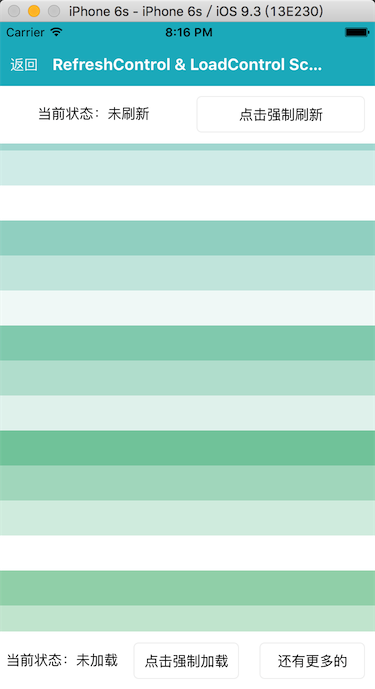
下拉刷新和加载更多
组件提供了上拉加载更多和下拉刷新的功能,分别在 loadControl 和 refreshControl 属性中传入 LoadControl 和 RefreshControl 组件即可,该功能只支持纵向滚动。
另外,当 LoadControl 组件从 Loading 状态切换到其他状态时,你需要手动调用 ScrollView 实例的 stopLoading 方法来切换。同理,对于 RefreshControl 组件刷新失败时也需要手动调用 this.scroller.stopRefreshing({ result: false }) 方法来切换状态。
import React, { Component } from 'react';
import { View, Text } from 'react-native';
import { ScrollView, RefreshControl, LoadControl } from  'qunar-react-native';

export default class Demo extends Component {
    constructor(props) {
        super(props);
        this.scroller = null;
        this.state = {
            listData: getCoupleOfRandomColor(20),
            noMore: false
        };
    }

    onRefresh() {
        setTimeout(() => {
            if (Math.random() > 0.5) {
                this.scroller.stopRefreshing({
                    result: true
                });
                this.setState({
                    listData: getCoupleOfRandomColor(20),
                    noMore: false
                });
            } else {
                this.scroller.stopRefreshing({
                    result: false
                });
            }
        }, 1000);
    }

    onLoad() {
        setTimeout(() => {
            if (this.state.listData.length >= 40) {
                this.setState({
                    noMore: true
                });
                this.scroller.stopLoading();
            } else {
                this.setState({
                    listData: this.state.listData.concat(getCoupleOfRandomColor(20))
                });
                this.scroller.stopLoading();
            }
        }, 1000);
    }

    render() {
        const { listData, noMore } = this.state;
        const listContent = listData.map((item, index) => (
            <View style={{ height: 50, backgroundColor: item }} key={index}>
                <Text style={{ margin: 5, color: '#fff', alignSelf: 'flex-end', fontSize: 32 }}>{index}</Text>
            </View>
        ));

        return (
            <ScrollView
                ref={ref => {
                    this.scroller = ref;
                }}
                style={{ flexGrow: 1, flexShrink: 1 }}
                refreshControl={
                    <RefreshControl onRefresh={() => this.onRefresh()}/>
                }
                loadControl={
                    <LoadControl
                        noMore={noMore}
                        onLoad={() => this.onLoad()}
                    />
                }
            >
                {listContent}
            </ScrollView>
        )
    }
}

const getCoupleOfRandomColor = num => {
    const colors = [];
    for (let i = 0; i < num; i++) {
        colors.push(getRandomColor());
    }
    return colors;
};

const getRandomColor = () => {
    const letters = '3456789ABC'.split('');
    let color = '#';
    for (let i = 0; i < 6; i++ ) {
        color += letters[Math.floor(Math.random() * 10)];
    }
    return color;
};
滚动特性
组件不仅提供了滚动容器,也提供了相关的滚动特性。
- 禁止滚动:
scrollEnabled - 弹性滚动:
bounces滚动是否能够超出屏幕范围 - 拖拽滚动视图时是否隐藏软键盘:
keyboardDismissMode
<ScrollView bounces >
    <Text>滚动内容</Text>
</ScrollView>
滚动到某一位置
组件提供了 scrollTo(config) 方法来滚动到某个位置。
config.x横向位移config.y纵向位移config.animated是否动画config.duration动画时长
<ScrollView ref="scoller" >
    <Text>滚动内容</Text>
</ScrollView>
this.refs.scroller.scrollTo({ y: 100 });
Sticky Header
在 stickyHeaderIndices 属性中设置一个子视图下标的数组,决定哪些成员会在滚动之后固定在屏幕顶端。
<ScrollView stickyHeaderIndices={[0, 3, 6, 9]}>
    {
        new Array(100).fill('').map((item, index) =>
            <View
                key={index}
                style={{
                    backgroundColor: getRandomColor()
                }}
            >
                <Text style={{ color: '#fff', fontSize: 15, padding: 10 }}>{index}</Text>
            </View>
        )
    }
</ScrollView>
属性
contentInset =={ EdgeInsetsPropType }==
内容范围相对滚动视图边缘的坐标。
默认值:
contentOffset =={ PointPropType }==
用来手动设置初始的滚动坐标。
默认值:
alwaysBounceHorizontal =={ bool }==
当此属性为true时,水平方向即使内容比滚动视图本身还要小,也可以弹性地拉动一截。
默认值: 当horizontal={true}时默认值为true,否则为false。
alwaysBounceVertical =={ bool }==
当此属性为true时,垂直方向即使内容比滚动视图本身还要小,也可以弹性地拉动一截。
默认值: 当horizontal={true}时默认值为false,否则为true。
bounces =={ bool }=={.type} >=v1.1.0
当值为true时,如果内容范围比滚动视图本身大,在到达内容末尾的时候,可以弹性地拉动一截。如果为false,尾部的所有弹性都会被禁用,即使alwaysBounce*属性为true。默认值为true。
默认值: true
contentContainerStyle =={ View.propTypes.style }==
ScrollView内容容器的样式,所有的子视图都会包裹在内容容器内。
decelerationRate =={ number|'fast'|'normal' }==
一个浮点数,用于决定当用户抬起手指之后进行惯性滚动时,滚动视图减速停下的速度。normal为0.998,fast为0.9。
默认值: 'normal'(即:0.998)
horizontal =={ bool }==
水平滚动。当该属性为true的时候,所有的的子视图会在水平方向上排成一行,而不是默认的在垂直方向上排成一列。
默认值: false
onScroll =={ function }==
(event) => void
在滚动的过程中,每帧调用一次此回调函数。
如果使用了RefreshControl组件,则y包含RefreshControl组件的高度。即:在顶部时,正常是 {contentOffset: {y: 0}},如果有RefreshControl组件,则为 {contentOffset: {y: 35}} (35为RefreshControl的默认高度)。
方法参数:
| 参数名 | 类型 | 描述 | 支持版本 |
|---|---|---|---|
| event | obj | {nativeEvent: {contentOffset: |
onScrollAnimationEnd =={ function }==
(event) => void
当滚动动画结束之后调用此回调。
方法参数:
| 参数名 | 类型 | 描述 | 支持版本 |
|---|---|---|---|
| event | obj | {nativeEvent: {contentOffset: |
pagingEnabled =={ bool }==
当值为true时,滚动条会停在滚动视图的尺寸的整数倍位置。这个可以用在水平或垂直的分页上。默认值为false。
注意:当使用pagingEnabled属性的时候,不允许在非scroll方向上使用 alwaysBounce* 属性。即:当 horizontal 为 true,pagingEnabled 为 true 的时候,不允许使用 alwaysBounceVertical ;当 horizontal 为 flase,pagingEnabled 为 true 的时候,不允许使用 alwaysBounceHorizontal
默认值: false
scrollEnabled =={ bool }==
当值为false的时候,内容不能滚动,默认值为true。
默认值: true
showsHorizontalScrollIndicator =={ bool }==
当此属性为true的时候,显示一个水平方向的滚动条。
默认值: false
showsVerticalScrollIndicator =={ bool }==
当此属性为true的时候,显示一个垂直方向的滚动条。
默认值: true
stickyHeaderIndices =={ array[number] }==
一个子视图下标的数组,用于决定哪些成员会在滚动之后固定在屏幕顶端。举个例子,传递stickyHeaderIndices={[0]}会让第一个成员固定在滚动视图顶端。这个属性不能和horizontal={true}一起使用。
keyboardDismissMode =={ enum('none', 'on-drag') }=={.type} >=v1.2.0
用户拖拽滚动视图的时候,是否要隐藏软键盘。none(默认值),拖拽时不隐藏软键盘。on-drag,当拖拽开始的时候隐藏软键盘。
默认值: 'none'
keyboardShouldPersistTaps =={ PropTypes.bool }=={.type} >=v1.3.0
默认值为true(默认值与rn不一样,主要是为了兼容之前的版本)。当此属性为true的时候,在软键盘激活之后,点击焦点文本输入框以外的地方,键盘不会自动消失。当此属性为false的时候,在软键盘激活之后,点击焦点文本输入框以外的地方,键盘就会隐藏。
注:该属性的默认值与官方相反,默认在点击其他区域时不会收起键盘。同时,该属性的表现也与官方有区别:官方版本,在点击其他区域时会首先收起键盘,再次点击才会触发对应的操作;qrn的版本,在点击其他区域时会同时收起键盘,触发对应的操作。 比如:页面上有输入框和『提交』按钮时,键盘弹起时点击按钮:官方版本会收起键盘,再次点击按钮才会触发按钮的点击事件;qrn版本在第一次点击『提交』按钮时就会收起键盘并且触发按钮的点击事件。
默认值: true
onMomentumScrollBegin =={ function }=={.type} >=v1.2.0
(event) => void
惯性滚动开始时的回调。
方法参数:
| 参数名 | 类型 | 描述 | 支持版本 |
|---|---|---|---|
| event | obj | {nativeEvent: {contentOffset: |
onMomentumScrollEnd =={ function }=={.type} >=v1.2.0
(event) => void
惯性滚动结束时的回调。
方法参数:
| 参数名 | 类型 | 描述 | 支持版本 |
|---|---|---|---|
| event | obj | {nativeEvent: {contentOffset: |
onScrollBeginDrag { function } >=v1.2.0
(event) => void
拖拽滚动开始时的回调。
方法参数:
| 参数名 | 类型 | 描述 | 支持版本 |
|---|---|---|---|
| event | obj | {nativeEvent: {contentOffset: |
onScrollEndDrag =={ function }=={.type} >=v1.2.0
(event) => void
拖拽滚动结束时的回调。
方法参数:
| 参数名 | 类型 | 描述 | 支持版本 |
|---|---|---|---|
| event | obj | {nativeEvent: {contentOffset: |
refreshControl =={ element }==
指定RefreshControl组件,用于为ScrollView提供下拉刷新功能。
loadControl =={ element }==
指定LoadControl组件,用于为ScrollView提供上拉加载功能。
onContentSizeChange =={ function }==
(width, height) => void
ScrollView内容容器onLayout时触发,所有的子视图都会包裹在内容容器内。
方法参数:
| 参数名 | 类型 | 描述 | 支持版本 |
|---|---|---|---|
| width | number | 内容容器宽度 | |
| height | number | 内容容器高度 |
style =={ View.propTypes.style }==
ScrollView的样式。
方法
scrollTo
滚动到某一位置,如果只在某一方向滚动,可以只传{x: x}或{y: y}。默认animated为true。
如果使用了RefreshControl组件,则y需要包含RefreshControl组件的高度。即:滚动到顶部,正常是 scrollTo({y: 0}),如果有RefreshControl组件,则 scrollTo({y: 35}) (35为RefreshControl的默认高度)。
方法参数:
| 参数名 | 类型 | 描述 | 必选 | 支持版本 |
|---|---|---|---|---|
| config | obj | 滚动配置 | ||
| config.x | number | 横向位移 | ||
| config.y | number | 纵向位移 | ||
| config.animated | bool | 是否动画 | ||
| config.duration | number | 动画时长 | 1.3.0 |
startRefreshing
当前组件有refreshControl属性,并且没有正在下拉刷新,则强制触发下拉刷新,变成正在刷新的状态
stopRefreshing
当前组件有refreshControl属性,并且正在下拉刷新,则停止下拉刷新的状态。默认带有动画,可以设置{animated: false}取消。
停止刷新时,会自动ScrollTo顶部,所以不需要外部再调用。滚动到顶部的过程中,会禁止ScrollView响应。
方法参数:
| 参数名 | 类型 | 描述 | 必选 | 支持版本 |
|---|---|---|---|---|
| config | obj | 停止刷新时的配置项 | ||
| config.animated | bool | 回到顶部是否需要动画 | ||
| config.duration | number | 回到顶部的动画时间,默认是300ms | 1.3.0 | |
| config.result | bool | 表示刷新成功还是失败。undefined:不显示刷新之后的状态;true:显示『加载成功』;false:显示『加载失败』 | 1.3.0 |
startLoading
当前组件有loadControl属性,并且没有正在加载,则强制触发加载更多,变成正在加载更多的状态
stopLoading
当前组件有loadControl属性,并且正在加载,则停止加载更多的状态
setContentOffsetBeforeLayout
本方法用来设置contentOffset相对当前的contentOffset偏移多少,在下一次render的时候会生效。本方法的主要使用场景是,当滚动内容的高度发生变化时(尤其是变小时),希望render之后,用户看到的内容位置是不变的。
方法参数:
| 参数名 | 类型 | 描述 | 必选 | 支持版本 |
|---|---|---|---|---|
| position | PointPropType | 设置相对当前contentOffset的位移量 |