Bubble 气泡标签组件
渲染出一个气泡标签
安装
npm install @qnpm/q-components --save --registry=http://npmrepo.corp.qunar.com
使用说明
显示代码
import { Bubble } from '@qnpm/q-components';
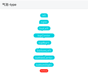
<Bubble text="left" type="left" />
<Bubble text="right" type="right" />
<Bubble text="topLeft" type="topLeft" />
<Bubble text="topCenter" type="topCenter" />
<Bubble text="topRight" type="topRight" />
<Bubble text="bottomLeft" type="bottomLeft" />
<Bubble text="bottomCenter" type="bottomCenter" />
<Bubble text="bottomRight" type="bottomRight" />
<Bubble text="notice" type="notice" />
显示代码
import { Bubble } from '@qnpm/q-components';
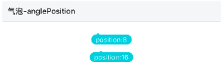
<Bubble
text="position:8"
type="bottomLeft"
anglePosition={8}
/>
<Bubble
text="position:16"
type="bottomLeft"
anglePosition={16}
/>
显示代码
import { Bubble } from '@qnpm/q-components';
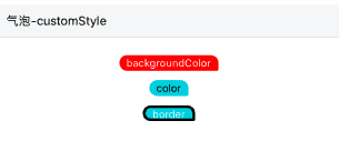
<Bubble
text="backgroundColor"
customStyle={{backgroundColor: 'red'}}
/>
<Bubble
text="color"
customStyle={{color: '#000'}}
/>
<Bubble
text="border"
customStyle={{borderColor: '#000', borderWidth: 3}}
/>
属性说明
| 属性名 | 类型 | 默认值 | 是否必须 | 说明 |
|---|---|---|---|---|
anglePosition |
number |
16 |
false |
有三角游标类三角游标位置(说明) |
customStyle |
CustomStyle | - | false |
自定义样式 |
needScale |
boolean |
- | false |
是否根据屏幕大小缩放 |
text |
string |
- | false |
气泡标签文案 |
type |
left|right|topLefttopCenter|topRight|bottomLeftbottomCenter|bottomRight|notice |
left |
false |
气泡标签类型(说明) |
type 说明
type共有以下几种类型:
'left' // 左提示(默认)
'right' // 右提示
'topLeft' // 顶部提示 下方三角形居左
'topCenter' // 顶部提示 下方三角形居中
'topRight' // 顶部提示 下方三角形居右
'bottomLeft' // 底部提示 下方三角形居左
'bottomCenter' // 底部提示 下方三角形居中
'bottomRight' // 底部部提示 下方三角形居右
'notice'; // 基础回显
customStyle 说明
customStyle仅支持以下几个属性:
'backgroundColor' // 填充色
'color' // 字体颜色
'borderColor' // 边框颜色(这个属性存在时才会有边框 type为 left\right\notice支持,其他展示有问题)
'borderWidth' // 边框大小(type为 left\right\notice支持,其他展示有问题)
'fontSize' // 内容字体大小
'wrapHeight' // 气泡容器高度
'borderRadiusConfig' // 气泡圆角,number | BorderRadiusConfigStyle
    interface BorderRadiusConfigStyle {
        topLeft?: number;
        topRight?: number;
        bottomLeft?: number;
        bottomRight?: number;
    }
anglePosition 说明
anglePosition只针对type为有三角形游标的生效