noticeItem 提示
渲染出一个提示
安装
npm install @qnpm/q-components --save --registry=http://npmrepo.corp.qunar.com
使用说明

显示代码
import { NoticeItem } from '@qnpm/q-components';
import { Icon } from '@qnpm/q-theme';

const topNode = <Icon name='chat' size={20} />;
const topNodeSmall = <Icon name='chat' size={16} />;

<NoticeItem
  topNode={topNode}
  text={'size-normal'}
  size="small"
  onClick={() => {}}
/>

<NoticeItem
  topNode={topNodeSmall}
  text={'size-small'}
  size="small"
  onClick={() => {}}
/>
显示代码
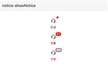
import { NoticeItem } from '@qnpm/q-components';
import { Icon } from '@qnpm/q-theme';

const topNode = <Icon name='chat' size={20} />;

<NoticeItem
  topNode={topNode}
  text={'红点'}
  showNotice
  onClick={() => {}}
/>
<NoticeItem
  topNode={topNode}
  text={'文案'}
  showNotice
  noticeText={'22'}
  onClick={() => {}}
/>
<NoticeItem
  topNode={topNode}
  text={'文案'}
  showNotice
  noticeText={'22'}
  showNoticeBorder
  onClick={() => {}}
  customStyle={{
    textColor: 'red',
    noticeBgColor: '#dbc0c0',
    borderColor: '#000'
  }}
/>
属性说明
| 属性名 | 类型 | 默认值 | 是否必须 | 说明 |
|---|---|---|---|---|
accessibilityPreName |
string |
`` | false |
无障碍标签前缀 |
customStyle |
Object |
- | false |
自定义样式 |
needScale |
boolean |
- | false |
是否根据屏幕大小缩放 |
noticeText |
number | string | ReactElement<any> |
- | false |
右上方提示内容 |
onClick |
Function |
- | false |
点击回调 |
showNotice |
boolean |
false |
false |
是否展示右上方提示 |
showNoticeBorder |
boolean |
false |
false |
右上方提示是否展示边框 |
size |
normal|small |
normal |
false |
展示大小 |
text |
string |
- | true |
下方文案 |
topNode |
ReactElement<any> |
- | true |
上方icon |
customStyle 说明
customStyle仅支持以下几个属性:
'textColor' // 下方文案颜色
'borderColor' // 右上提示边框色
'noticeBgColor' // 右上提示背景色