QTextInput 输入框&键盘组件
渲染出一个输入框
特殊说明
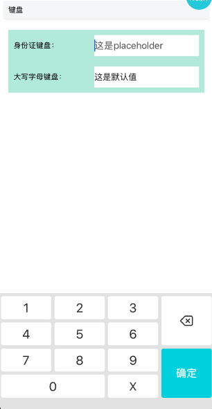
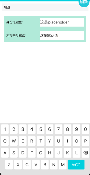
- 支持身份证键盘和数字大写字母键盘
- 受控组件输入框内容使用value控制
- native桥接组件,版本不满足时,直接渲染RN自带TextInput QRN: 4.5.4
IOS: 80011230
Android: 60001357
安装
npm install @qnpm/q-textInput --save --registry=http://npmrepo.corp.qunar.com
使用说明
显示代码
import QTextInput from '@qnpm/q-textInput';

<View style={styles.row}>
    <Text>{'身份证键盘:'}</Text>
    <QTextInput
        style={{
            width: 200,
            height: 40,
            backgroundColor: 'white',
            fontSize: 18
        }}
        color={'#212121'}
        placeholder={"这是placeholder"}
        maxLength={20}
        value={value}
        placeholderTextColor={'#616161'}
        keyboardType={'idCard'}
        clearButtonMode={'while-editing'}
        onChangeText={(text) => {
            console.log('text ', text);
            setValue(text);
        }}
        onBlur={(e) => {
            console.log('blur ');
            console.log('e ', e);
        }}
        onFocus={(e) => {
            console.log('focus ');
            console.log('e ', e);
        }}
    />
</View>
显示代码
<View style={styles.row}>
    <Text>{'大写字母键盘:'}</Text>
    <QTextInput
        style={{
            width: 200,
            height: 40,
            backgroundColor: 'white',
            fontSize: 18
        }}
        value={defaultValue}
        placeholder={"这是placeholder"}
        placeholderTextColor={'#616161'}
        keyboardType={'capital'}
        onFocus={(e) => {
            console.log('focus ', e);
        }}
        onBlur={(e) => {
            console.log('blur ', e);
        }}
        onChangeText={(text) => {
            console.log('text: ', text);
            setDefaultValue(text);
        }}
    />
</View>
属性说明
| 属性名 | 类型 | 默认值 | 是否必须 | 说明 |
|---|---|---|---|---|
clearButtonMode |
never|while-editing|unless-editing|always |
never |
false |
清空按钮显示方式,仅iOS支持,默认不显示 |
clearIconMarginRight |
number |
0 |
false |
清空按钮居右边距,仅iOS支持 |
color |
string |
- |
false |
字色,放到style里也可以 |
fontSize |
number |
- |
false |
字号,放到style里也可以 |
keyboardType |
idCard|capital |
- |
false |
身份证|数字+大写字母键盘 |
maxLength |
number |
- |
false |
输入框最大长度,默认不限 |
needFormat |
boolean |
false |
false |
是否格式化字符串,原机票逻辑,谨慎使用 |
onBlur |
(e: any) => void |
- |
false |
失去焦点时回调 |
onChangeText |
(text: string) => void |
- |
false |
内容改变时回调 |
onFocus |
(e: any) => void |
- |
false |
获取焦点时回调 |
placeholder |
string |
- |
false |
空框提示值,默认无 |
placeholderTextColor |
string |
- |
false |
空框提示值颜色 |
value |
string |
- |
false |
设置显示值 |
clearButtonMode 说明
共有以下几种类型:
'never' // 默认不展示
'while-editing' // 编辑时
'unless-editing' // 不编辑时
'always' // 一直展示