button 按钮组件
渲染出一个按钮
特殊说明
Button除了支持属性说明中列出的属性外,也支持TouchableOpacity的所有属性(除style外)。如果同时传了
leftIcon和rightIcon,会优先展示leftIcon,rightIcon将不进行展示。
安装
npm install @qnpm/q-components --save --registry=http://npmrepo.corp.qunar.com
使用说明
显示代码
import { Button } from '@qnpm/q-components';
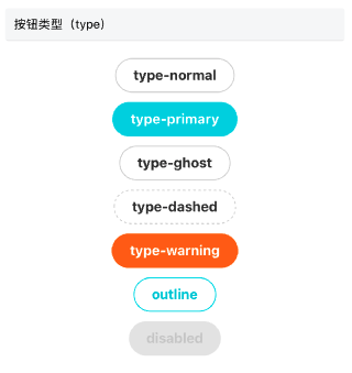
<Button text={'type-normal'} type={'normal'} />
<Button text={'type-primary'} type={'primary'} />
<Button text={'type-ghost'} type={'ghost'} />
<Button text={'type-dashed'} type={'dashed'} />
<Button text={'type-warning'} type={'warning'} />
<Button text={'outline'} outline />
<Button text={'disabled'} disabled />
显示代码
import { Button } from '@qnpm/q-components';
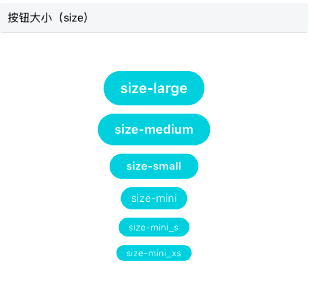
<Button text={'size-large'} size={'large'} />
<Button text={'size-medium'} size={'medium'} />
<Button text={'size-small'} size={'small'} />
<Button text={'size-mini'} size={'mini'} />
<Button text={'size-mini_s'} size={'mini_s'} />
<Button text={'size-mini_xs'} size={'mini_xs'} />
显示代码
import { Button } from '@qnpm/q-components';
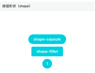
<Button text={'shape-capsule'} shape={'capsule'} />
<Button text={'shape-fillet'} shape={'fillet'} />
<Button text={'1'} shape={'circle'} />
显示代码
import { Button } from '@qnpm/q-components';
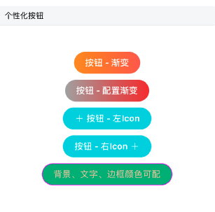
<Button text={'按钮 - 渐变'} needGradient={true} />
<Button
text={'按钮 - 配置渐变'}
needGradient={true}
gradientColors={["#aaa", "#e33"]}
/>
<Button text={'按钮 - 左Icon'} leftIcon={'plus'} />
<Button text={'按钮 - 右Icon'} rightIcon={'plus'} />
<Button
text={'背景、文字、边框颜色可配'}
customStyle={{
backgroundColor: '#00B87A',
color: '#E2C79E',
borderColor: '#f0f'
}}
/>
属性说明
| 属性名 | 类型 | 默认值 | 是否必须 | 说明 |
|---|---|---|---|---|
accessibilityPreName |
string |
`` | false |
无障碍标签前缀 |
customStyle |
customStyle | null |
false |
自定义样式 |
gradientColors |
Array |
["#FF950A", "#FF6600"] |
false |
用户自定义背景渐变色, 生效条件type=normal/primary && outline === false && shape === 'capsule' |
leftIcon|rightIcon |
string | ReactElement |
'' | false |
按钮左右图标 |
needGradient |
boolean |
false |
false |
是否需要背景渐变, 渐变颜色为默认值, 生效条件type=normal/primary && outline === false && shape === 'capsule' |
needScale |
boolean |
false |
false |
是否开启缩放模式,开启后会对按钮的宽|高度|间距|字体等根据屏幕进行缩放 |
outline |
boolean |
false |
false |
是否线框无填充色按钮 |
shape |
capsule|fillet|circle |
capsule |
false |
按钮形状 |
size |
large|medium|smallmini|mini_s|mini_xs |
medium |
false |
按钮大小 |
text |
string | number | ReactElement |
'' | true |
按钮文字 |
type |
normal|primary|ghostdashed|warning |
primary |
false |
按钮类型 |
shape 说明
注意: 如果
shape类型为circle,则会忽略自定义的宽度,直接使用内置按钮size对应的高度作为按钮宽度实现圆形。
customStyle 说明
customStyle 允许修改以下样式
| 属性名 | 类型 | 默认值 | 是否必须 | 说明 |
|---|---|---|---|---|
width |
number |
'' | false |
按钮宽度 |
fontWeight |
string |
normal |
false |
字体粗细 |
borderWidth |
number |
1 |
false |
按钮边框粗细 |
borderColor |
string |
'' | false |
按钮边框颜色 |
color |
string |
'' | false |
按钮字体颜色 |
backgroundColor |
string |
'' | false |
按钮背景色 |
paddingHorizontal |
number |
'' | false |
按钮左右边距,版本:>0.0.9 |
paddingLeft |
number |
'' | false |
按钮左边距,版本:>0.0.9 |
paddingRight |
number |
'' | false |
按钮右边距,版本:>0.0.9 |
关于默认按钮间距
| size | 间距 |
|---|---|
large |
20 |
medium |
20 |
small |
20 |
mini |
12 |
mini_s |
12 |
mini_xs |
12 |