review 评分组件
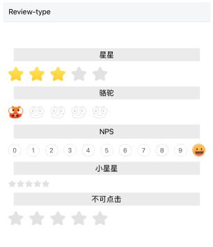
渲染出一个评分组件
特殊说明
- 受控组件,选中某个item,完全依赖传入的score
- 支持星星类型,骆驼类型,nps类型和自定义类型,其中自定义类型不支持nps
安装
npm install @qnpm/q-review --save --registry=http://npmrepo.corp.qunar.com
使用说明
显示代码
import Review from '@qnpm/q-review';
const CommonReview = (props) => {
    const [score, setScore] = useState(5);
    return (
      <Review
        score={score}
        onClickItem={
            (score) => {setScore(score)}
        }
        {...props}
      />
    )
};

<CommonReview type={0}/>
<CommonReview type={1}/>
<CommonReview type={2}/>
<CommonReview type={4}/>
<CommonReview disabled />

显示代码
import Review from '@qnpm/q-review';

const CommonReview = (props) => {
    const [score, setScore] = useState(5);
    return (
      <Review
        score={score}
        onClickItem={
            (score) => {setScore(score)}
        }
        {...props}
      />
    )
};

<CommonReview
    type={3}
    customConfig={{
        scoreSystem: 10,
        defaultIcon: 'https://xx/xx/camel.png',
        activeIcons: ACTIVE_ICONS
    }}
/>
<CommonReview
    customStyle={{
        wrapperStyle: {
            margin: 20
        },
        itemStyle: {
            width: 14,
            height: 14,
            spacing: 2
        }
    }}
/>
属性说明
| 属性名 | 类型 | 默认值 | 是否必须 | 说明 |
|---|---|---|---|---|
customConfig |
ReviewCustomConfig |
undefined |
false |
当type是自定义类型时,会根据这个字段的配置展示,不是自定义类型此字段无效,不支持nps类型的自定义 |
customStyle |
ReviewCustomStyle |
undefined |
false |
部分支持自定义style |
disabled |
boolean |
false |
false |
是否可点击,默认可点,样式无影响 |
needScale |
boolean |
false |
false |
是否缩放,默认false |
onClickItem |
(score: number, prevScore: number) => void; |
undefined |
false |
点击item回调,score为点击的分数,prevScore为点击前的分数,注意不是索引 |
score |
number |
0 |
true |
展示的分数,必传,展示受控于这个值 |
type |
0|1|2|3|4 |
0 |
false |
展示类型,默认是0,也就是星星类型,参考ReviewType |
type 说明
type共有以下几种类型:
'0' // 星星
'1' // 骆驼
'2' // NPS类型
'3' // 自定义类型,需自己传配置
'4' // 纯展示小星星
reviewCustomConfig 说明
| 属性名 | 类型 | 默认值 | 是否必须 | 说明 |
|---|---|---|---|---|
activeIcons |
string[] |
undefined |
true |
选中时展示icon,支持多张 |
defaultIcon |
string |
undefined |
true |
未选时置灰icon,只支持图片url |
locations |
number[] |
undefined |
false |
对应选中时展示icon的展示起始位置,不传默认平分放置icon |
scoreSystem |
number |
5 |
false |
几分制,默认是最大5分,几分就是展示几个按钮 |
reviewCustomStyle 说明
| 属性名 | 类型 | 默认值 | 是否必须 | 说明 |
|---|---|---|---|---|
wrapperStyle |
ReviewWrapperStyle |
undefined |
false |
外层容器部分,仅支持margin |
itemStyle |
width|height|spacing |
undefined |
false |
条目部分支持style |