Dialog 弹窗组件
渲染出一个弹窗:基础弹窗BasicsAlert和自定义弹窗CustomAlert
安装
npm install @qnpm/q-dialog --save --registry=http://npmrepo.corp.qunar.com
使用说明
显示代码
import { BasicsAlert } from '@qnpm/q-dialog';
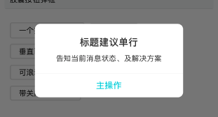
BasicsAlert.alert(
'标题建议单行',
'告知当前消息状态、及解决方案',
[{
text: '主操作',
}]
);
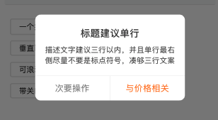
BasicsAlert.alert(
'标题建议单行',
'告知当前消息状态、及解决方案',
[{
text: '次要操作',
textColor: '#737373'
},
{
text: '与价格相关',
textColor: '#FF6600'
}]
);
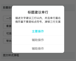
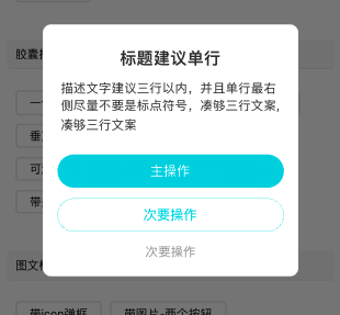
BasicsAlert.alert(
'标题建议单行',
'告知当前消息状态、及解决方案',
[{
text: '次要操作',
textColor: '#737373'
},
{
text: '次要操作',
textColor: '#737373'
},
{
text: '与价格相关',
textColor: '#FF6600'
}]
);

显示代码
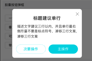
import { CustomAlert } from "@qnpm/q-dialog";

<CustomAlert
    visible={this.state.visible}
    animationType={'fade'}
    title={标题建议单行}
    content={{
        msg: message2
    }}
    btnGroup={{
        primaryBtn:{
            text:button1,
            colors:['#00D4E3'],
            onPress: ()=>{
                this.setState({
                    visible:false
                })
            }
        }
    }}
/>
<CustomAlert
    visible={this.state.visible}
    animationType={'fade'}
    title={标题建议单行}
    content={{
        msg: message2
    }}
    btnGroup: {{
        primaryBtn:{
            text:button1,
            colors:['#00D4E3'],
            onPress: ()=>{
                this.setState({
                    visible:false
                })
            }
        },
        secondaryBtn:{
            text:button1,
            colors:['#00D4E3'],
            onPress: ()=>{
                this.setState({
                    visible:false
                })
            }
        }
    }}
/>
<CustomAlert
    visible={this.state.visible}
    animationType={'fade'}
    title={标题建议单行}
    content={{
        msg: message2
    }}
    btnGroup={{
        primaryBtn:{
            text:button1,
            colors:['#00D4E3'],
            onPress: ()=>{
                this.setState({
                    visible:false
                })
            }
        },
        secondaryBtn:{
            text:button1,
            colors:['#00D4E3'],
            onPress: ()=>{
                this.setState({
                    visible:false
                })
            }
        },
        thirdBtn:{
            text:button1,
            colors:['#00D4E3'],
            onPress: ()=>{
                this.setState({
                    visible:false
                })
            }
        },
        orientation: 'vertical'
    }}
/>

显示代码
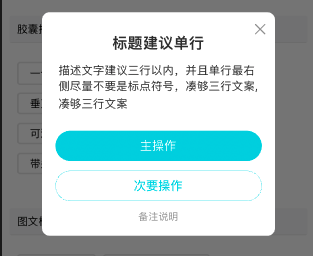
import { CustomAlert } from "@qnpm/q-dialog";

<CustomAlert
    visible={this.state.visible}
    animationType={'fade'}
    title={标题建议单行}
    content={{
        msg: message2
    }}
    remarks="备注说明"
    btnGroup={{
        primaryBtn:{
            text:button1,
            colors:['#00D4E3'],
            onPress: ()=>{
                this.setState({
                    visible:false
                })
            }
        },
        secondaryBtn:{
            text:button1,
            colors:['#00D4E3'],
            onPress: ()=>{
                this.setState({
                    visible:false
                })
            }
        }
    }}
/>
<CustomAlert
    visible={this.state.visible}
    animationType={'fade'}
    title={标题建议单行}
    content={{
        msg: message2
    }}
    checkBoxProps={{
        checkBoxMsg: '勾选即同意隐私协议',
        checked: true
    }}
    btnGroup={{
        primaryBtn:{
            text:button1,
            colors:['#00D4E3'],
            onPress: ()=>{
                this.setState({
                    visible:false
                })
            }
        }
    }}
/>


显示代码
import { CustomAlert } from "@qnpm/q-dialog";
<CustomAlert
visible={this.state.visible}
animationType={'fade'}
title={标题建议单行}
imageProps={{
styleType:'icon',
uri: QImageSet.musicIcon,
}}
content={{
msg: message2
}}
btnGroup={{
primaryBtn:{
text:button1,
colors:['#00D4E3'],
onPress: ()=>{
this.setState({
visible:false
})
}
}
}}
/>
<CustomAlert
visible={this.state.visible}
animationType={'fade'}
title={标题建议单行}
imageProps={{
styleType:'embed',
embedSize: 'small',
uri: QImageSet.musicIcon,
}}
content={{
msg: message2
}}
btnGroup={{
primaryBtn:{
text:button1,
colors:['#00D4E3'],
onPress: ()=>{
this.setState({
visible:false
})
}
}
}}
/>
<CustomAlert
visible={this.state.visible}
animationType={'fade'}
title={标题建议单行}
imageProps={{
styleType:'banner',
embedSize: 'small',
uri: QImageSet.alertTopImg,
}}
content={{
msg: message2
}}
btnGroup={{
primaryBtn:{
text:button1,
colors:['#00D4E3'],
onPress: ()=>{
this.setState({
visible:false
})
}
}
}}
/>
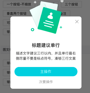
<CustomAlert
visible={this.state.visible}
animationType={'fade'}
title={标题建议单行}
imageProps={{
styleType:'alien',
uri: QImageSet.alertAlienImg
}}
content={{
msg: message2
}}
btnGroup={{
primaryBtn:{
text:button1,
colors:['#00D4E3'],
onPress: ()=>{
this.setState({
visible:false
})
}
}
}}
/>
属性说明BasicsAlert
| 属性名 | 类型 | 默认值 | 是否必须 | 说明 |
|---|---|---|---|---|
buttons |
BaseAlertButton[] |
undefind |
false |
弹框的按钮信息 |
message |
string |
'' |
false |
弹框的内容文案 |
options |
AlertOptions |
undefind |
false |
弹框的配置选项 |
title |
string |
'' |
false |
弹框的标题 |
BaseAlertButton 说明
| 属性名 | 类型 | 默认值 | 是否必须 | 说明 |
|---|---|---|---|---|
onPress |
(value?: string) => void |
undefined |
false |
按钮的点击事件 |
style |
default|cancel|destructive |
default |
false |
按钮的类型 |
text |
string |
'' |
false |
按钮的文案 |
textColor |
string |
'#00D4E3' |
false |
按钮文案的颜色 |
AlertOptions 说明
| 属性名 | 类型 | 默认值 | 是否必须 | 说明 |
|---|---|---|---|---|
cancelable |
boolean |
false |
false |
点击弹框阴影区域是否可关闭 |
onDismiss |
() => void |
undefined |
false |
弹框关闭的回调函数 |
属性说明CustomAlert
| 属性名 | 类型 | 默认值 | 是否必须 | 说明 |
|---|---|---|---|---|
accessibilityPreName |
string |
`` | false |
无障碍标签前缀 |
animationType |
none|slide|fade |
none |
false |
弹框显示的动画效果 |
btnGroup |
ButtonGroupProps |
undefined |
false |
弹框的按钮信息 |
checkBoxProps |
CheckBoxProps |
undefined |
false |
弹框底部checkBox信息 |
children |
React.ReactElement |
undefined |
false |
自定义组件 |
closeBtn |
CloseBtnProps |
undefined |
false |
弹框关闭按钮信息 |
content |
ContentProps |
undefined |
false |
弹框内容信息 |
focusInfo |
FocusInfoProps |
undefined |
false |
用户关注信息 |
iconFontProps |
IconFontProps |
undefined |
false |
可设置icon的fontFamily |
imageProps |
ImageProps |
undefined |
false |
弹框中图片信息 |
isHigher |
boolean |
false |
false |
是否使用60%屏幕高度的弹框 |
needScale |
boolean |
true |
false |
间距、尺寸、字号是否缩放 |
onRequestClose |
() => viod |
undefind |
false |
android物理返回键的事件处理函数 |
remarks |
string or RemarksProps |
undefined |
false |
弹框底部的备注信息 |
title |
string |
'' |
false |
弹框标题 |
visible |
boolean |
false |
true |
是否显示 |
onlyShowChild |
boolean |
false |
false |
弹框内容中仅显示外部传入的children属性 |
onMaskPress |
() => viod |
undefind |
false |
点击阴影背景的回调函数 |
ContentProps 说明
| 属性名 | 类型 | 默认值 | 是否必须 | 说明 |
|---|---|---|---|---|
msg |
string |
'' |
false |
弹框内容主要文案 |
msgDetail |
string |
'' |
false |
弹框内容详细文案 |
scrollable |
string |
'' |
false |
弹框内容文案过长时,是否支持垂直滚动 |
focusInfoProps 说明
| 属性名 | 类型 | 默认值 | 是否必须 | 说明 |
|---|---|---|---|---|
text |
string |
'' |
false |
内容,不传则不出 |
bgColor |
string |
'' |
false |
背景颜色 |
coloR |
string |
'' |
false |
字体颜色 |
ButtonGroupProps 说明
| 属性名 | 类型 | 默认值 | 是否必须 | 说明 |
|---|---|---|---|---|
orientation |
vertical|horizontal |
'horizontal' |
false |
primaryBtn和secondaryBtn的排版方向 |
primaryBtn |
ButtonProps |
undefined |
false |
主要按钮信息 |
secondaryBtn |
ButtonProps |
undefined |
false |
次要按钮信息 |
thirdBtn |
ButtonProps |
undefined |
false |
第三个按钮信息按钮信息, 需要orientation=vertical |
type |
capsule|simple |
'capsule' |
false |
按钮的类型:capsule胶囊型、simple简单型 |
ButtonProps 说明
| 属性名 | 类型 | 默认值 | 是否必须 | 说明 |
|---|---|---|---|---|
colors |
string[] |
unedefined |
false |
|
onPress |
() => void |
undefined |
false |
按钮的点击事件 |
text |
string |
'' |
true |
按钮文字 |
RemarksProps 说明
| 属性名 | 类型 | 默认值 | 是否必须 | 说明 |
|---|---|---|---|---|
onPress |
() => void |
undefined |
false |
按钮的备注文案的点击事件 |
text |
string |
'' |
true |
备注文案 |
CheckBoxProps 说明
| 属性名 | 类型 | 默认值 | 是否必须 | 说明 |
|---|---|---|---|---|
checkBoxMsg |
string |
'' |
true |
checkbox右侧的描述文案 |
checked |
boolean |
false |
false |
checkbox的选中状态 |
colorOn |
string |
#00D4E3 |
false |
checkbox的打开时颜色 |
colorOff |
string |
#999999 |
false |
checkbox的关闭时颜色 |
onMsgPress |
() => void |
undefined |
false |
描述文案的点击事件 |
onCheckedChange |
(newState: boolean) => void |
undefined |
false |
checkbox的选中状态改变时回调函数 |
ImageProps 说明
| 属性名 | 类型 | 默认值 | 是否必须 | 说明 |
|---|---|---|---|---|
bannerSize |
small|large |
small |
false |
banner图的尺寸,small: 280140; large: 280220 |
embedSize |
small|large |
small |
false |
内嵌图的尺寸,small: 8080; large: 140140 |
styleType |
banner|icon|alien|embed |
'' |
true |
图片的类型:大图banner、小icon、异形图、内嵌图 |
uri |
string |
'' |
true |
图片地址 |
CloseBtnProps 说明
| 属性名 | 类型 | 默认值 | 是否必须 | 说明 |
|---|---|---|---|---|
color |
string |
rgba(51, 51, 51, 0.5) |
false |
关闭按钮的颜色 |
onPress |
() => void |
undefined |
false |
关闭按钮的事件 |
size |
number |
18 |
false |
关闭按钮的尺寸 |
colors 说明
primaryBtn: 支持渐变色背景,可以设置2个颜色,不设置采用默认色#00D4E3,只提供一个色值的话就是非渐变的背景;
secondaryBtn: 取第一个color作为文字颜色和按钮描边颜色,默认 #00CAD8;
thirdBtn:不支持自定义颜色
isHigher 说明
显示内容的scrollView的最大高度=60%屏幕的整体高度-icon高度-title高度-button高度计算出来的,
又因为dialog中还有其他元素会占高度,所以最终dialog的显示高度会接近60%,不一定跟60%屏幕高度完全相等