label 标签组件
渲染出一个标签
安装
npm install @qnpm/q-components --save --registry=http://npmrepo.corp.qunar.com
使用说明
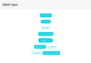
显示代码
import { Label } from '@qnpm/q-components';

<Label
    type="fill"
    text="fill-basic"
    fillType="basic"
/>
<Label
    type="fill"
    text="fill-full"
    fillType="full"
/>
<Label type="border" text="border" />
<Label
    type="angle"
    text="angle-basic"
    angleType="basic"
/>
<Label
    type="angle"
    text="angle-full"
    angleType="full"
/>
<Label
    title="组合样式"
    text="combine"
    type="combine"
/>
<Label
  title="组合样式-反转"
  text="combine"
  type="combine"
  isReverse
/>
显示代码
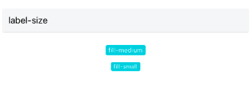
import { Label } from '@qnpm/q-components';

<Label
    type="fill"
    text="fill-medium"
    size="medium" />
<Label
    type="fill"
    text="fill-small"
    size="small"
/>
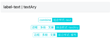
显示代码
import { Label } from '@qnpm/q-components';

<Label
  title="组合样式-text"
  text="combine"
  type="combine"
  isReverse
/>
<Label
  title="组合样式-textAry"
  textArray={['边框', '多段', '文案']}
  type="combine"
  isReverse
/>
<Label
  title="组合样式-都有"
  text="combine"
  textArray={['边框', '多段', '文案']}
  type="combine"
  isReverse
/>
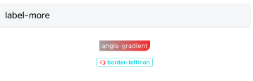
显示代码
import { Label } from '@qnpm/q-components';
import { Icon } from '@qnpm/q-theme';

const leftIcon =
    <Icon
        name="chat"
        size={10}
        color="red"
    />;
<Label
  type="angle"
  text="angle-gradient"
  needGradient
  gradientColors={["#aaa", "#e33"]}
/>
<Label
  text="border-leftIcon"
  type="border"
  leftIcon={leftIcon}
  customStyle={customStyle} size={'small'}
/>
属性说明
| 属性名 | 类型 | 默认值 | 是否必须 | 说明 |
|---|---|---|---|---|
accessibilityPreName |
string |
`` | false |
无障碍标签前缀 |
angleType |
basic|full |
basic |
false |
角标类标签--细分类型 |
customStyle |
object |
- | false |
自定义样式 |
fillType |
basic|full |
basic |
false |
背景填充类标签--细分类型 |
gradientColors |
Array |
["#FF950A", "#FF6600"] |
false |
用户自定义背景渐变色,只有type=fill/angle时候支持 |
isReverse |
boolean |
false |
false |
combine类型时,支持左右部分反转 |
leftIcon |
React.ReactElement<any> |
- | false |
左边icon,这里可以使任意合法的React元素 |
maxLabelWidth |
number |
- | false |
combine类型时,控制label的最大宽度 |
needGradient |
boolean |
false |
false |
是否需要背景渐变, 渐变颜色为默认值, 只有type=fill/angle时候支持 |
needScale |
boolean |
- | false |
是否根据屏幕大小缩放 |
size |
medium|small |
medium |
false |
标签大小,支持:>=0.0.19 |
text |
string | React.ReactElement<any> |
- | false |
标签文案 |
textArray |
Array |
- | false |
多个标签文案(仅带边框样式支持),支持图片(传入图片时maxLabelWidth失效),优先级高于text |
title |
string |
- | false |
combine标签--标题文案 |
type |
fill|border|combineangle |
fill |
false |
标签类型 |
属性说明
type 说明
type共有以下几种类型:
'fill' // 背景填充类(默认)
'border' // 填充+边框
'combine' // 带标题 >=1.0.22
'angle' // 角标类
fillType 说明
fillType(fill类标签--细分类型)共有以下几种类型:
'basic' // 小圆角(默认)
'full' // 全圆角
angleType 说明
angleType(angle标签--细分类型)共有以下几种类型:
'basic' // 右侧下方圆角(默认)
'full' // 右侧全圆角
customStyle 说明
customStyle仅可修改以下几种类型(combine类型 左右两部分分别修改):
'titleBgColor' // 标题背景色(组合样式)
'titleColor' // 标题字体颜色(组合样式)
'textBgColor' // 背景色
'textColor' // 字体颜色
'borderColor' // 边框颜色
'titleWeight' // 标题粗细
'textWeight' // 字体粗细