floatingButton 浮动组件
渲染出一个浮动按钮组件
安装
npm install @qnpm/q-floating-button --save --registry=http://npmrepo.corp.qunar.com
使用说明

显示代码
import FloatingButton from '@qnpm/q-floating-button';

const AD_IMG = "https://xx.jpg";
const CommonButton = (props) => {
  const [
    show, setShow
  ] = useState(true);
  return (
    <View>
      <FloatingButton
        show={show}
        {...props}
      />
      <TouchableOpacity
        onPress={() => {
          setShow(!show);
        }}
        style={styles.actionArea}
      >
        <Text>{props._key || ''}--click here</Text>
      </TouchableOpacity>
    </View>
  );
}
const typeRender = () => (
  <View style={styles.container}>
    <CommonButton
      _key="type:text"
      type="text"
      title="按钮"
    />
    <CommonButton
      _key="type:icon"
      type="icon"
      icon="addBold"
    />
    <CommonButton
      _key="type:mixed"
      type="mixed"
      title="按钮"
      icon="addBold"
    />
    <CommonButton
      _key="type:ad"
      type="ad"
      adImageUrl={AD_IMG}
    />
  </View>
);

显示代码
import FloatingButton from '@qnpm/q-floating-button';

const AD_IMG = "https://xx.jpg";
const CommonButton = (props) => {
  const [
    show, setShow
  ] = useState(true);
  return (
    <View>
      <FloatingButton
        show={show}
        {...props}
      />
      <TouchableOpacity
        onPress={() => {
          setShow(!show);
        }}
        style={styles.actionArea}
      >
        <Text>{props._key || ''}--click here</Text>
      </TouchableOpacity>
    </View>
  );
}
const animationRender = () => (
  <View style={styles.container}>
    <CommonButton
      _key="无动画"
      type="text"
      title="按钮"
    />
    <CommonButton
      _key="动画move"
      type="text"
      title="按钮"
      animationType="move"
      animationDirection="top"
      animationDurnation={300}
      animatedOffset={20}
    />
    <CommonButton
      _key="动画rotate"
      type="text"
      title="按钮"
      animationType="rotate"
      animationDirection="top"
    />
    <CommonButton
      _key="动画spin"
      type="text"
      title="按钮"
      animationType="spin"
      animationDirection="top"
    />
  </View>
);
显示代码
import FloatingButton from '@qnpm/q-floating-button';
const AD_IMG = "https://xx.jpg";
const CommonButton = (props) => {
const [
show, setShow
] = useState(true);
return (
<View>
<FloatingButton
show={show}
{...props}
/>
<TouchableOpacity
onPress={() => {
setShow(!show);
}}
style={styles.actionArea}
>
<Text>{props._key || ''}--click here</Text>
</TouchableOpacity>
</View>
);
}
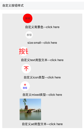
const styleRender = () => (
<View style={styles.container}>
<CommonButton
_key="自定义背景色"
type="text"
title="按钮"
customStyle={{
backgroundColor: 'red'
}}
/>
<CommonButton
_key="size:small"
type="text"
title="按钮"
size="small"
/>
<CommonButton
_key="自定义text类型文本"
type="text"
title="按钮"
titleColor="red"
titleFontSize={30}
/>
<CommonButton
_key="自定义icon类型"
type="icon"
title="按钮"
iconColor="red"
iconFontSize={30}
/>
<CommonButton
_key="自定义mixed类型"
type="mixed"
icon="addBold"
title="按钮"
titleColor="blue"
iconColor="red"
/>
<CommonButton
_key="自定义ad类型文本"
type="ad"
adImageUrl={AD_IMG}
imageSize={{
width: 100,
height: 100
}}
/>
</View>
);
显示代码
import FloatingButton from '@qnpm/q-floating-button';
const AD_IMG = "https://xx.jpg";
const CommonButton = (props) => {
const [
show, setShow
] = useState(true);
return (
<View>
<FloatingButton
show={show}
{...props}
/>
<TouchableOpacity
onPress={() => {
setShow(!show);
}}
style={styles.actionArea}
>
<Text>{props._key || ''}--click here</Text>
</TouchableOpacity>
</View>
);
}
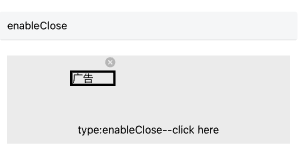
const enableCloseRender = () => (
<View style={styles.container}>
<CommonButton
_key="type:enableClose"
type="enableClose"
renderType="element"
renderContent={
<View
style={{
borderWidth: 3
}}
>
<Text>广告</Text>
</View>
}
/>
</View>
);
属性说明
| 属性名 | 类型 | 默认值 | 是否必须 | 说明 |
|---|---|---|---|---|
accessibilityPreName |
string |
无默认值 |
false |
无障碍标签前缀 |
adImageUrl |
string |
无默认值 |
false |
type:ad类型下广告图片 |
animationDirection |
string |
right |
false |
浮动按钮动画方向,当animationType为非none时有效 |
animationDurnation |
number |
300 |
false |
动画执行时长 |
animatedOffset |
number |
22 |
false |
动画偏移距离,当animationType为move时有效 |
animationType |
none|move|rotatespin |
none |
false |
用于指定动画类型 |
clickAreaWidth |
number |
60 |
false |
type=enableClose时按钮有效点击区域宽度 |
clickAreaHeight |
number |
60 |
false |
type=enableClose时按钮有效点击区域高度 |
customStyle |
ViewStyle |
{} |
false |
指定浮动按钮的样式,宽高不可自定义 |
icon |
string |
无默认值 |
false |
type=icon|mixed时所展示的图标 |
iconColor |
string |
#333333 |
false |
type=icon|mixed时图标颜色 |
iconFontSize |
number |
12 |
false |
type=icon|mixed时图标字体大小 |
imageSize |
object |
{width: 50, height: 50} |
false |
type=ad时广告尺寸 |
lottieViewConfig |
object |
无默认值 |
type=enableClose & renderType === 'lottie' |
lottie配置 |
needScale |
boolean |
false |
false |
是false支持缩放 |
onPress |
function |
无默认值 |
false |
浮动按钮点击回调 |
onClose |
function |
无默认值 |
false |
浮动按钮点击关闭回调 |
renderType |
image|lottie|element |
无默认值 |
是 |
type=enableClose时按钮主体区域渲染类型 |
renderContent |
element |
无默认值 |
当renderType === 'element' |
自定义内容 |
reservedWidth |
number |
12 |
false |
type=enableClose时滑出后再可视区域露出的宽度 |
show |
boolean |
false |
false |
时按钮是否展示,若有动画,则表示动画前后两种状态 |
size |
large|small |
large |
false |
浮动按钮尺寸类型,非ad类型下生效 |
slideOut |
boolean |
true |
false |
type=enableClose时是否滑出 |
title |
string |
无默认值 |
false |
text或者mixed类型是所展示的文本,最多两个字 |
titleColor |
string |
#333333 |
false |
text或者mixec类型下文本颜色 |
titleFontSize |
number |
11 |
false |
text或者mixec类型下文本字体大小 |
type |
text|icon|mixedad|enableClose |
text |
false |
指定浮动按钮的类型,默认text类型 |
type 说明
type共有以下几种类型:
'text' // 按钮上只有文本,最多两个字
'icon' // 图标类型,只能用[Q-Design图标](#https://ued.qunar.com/qrn/q-design-theme/Icon/index.html)
'mixed' // 图标+文字混合类型,文字最多两个字
'ad' // 广告图片类型,支持组件尺寸调整
'enableClose' // 运营类浮动球,带关闭按钮
animationDirection 说明
当type为move时:top、right、bottom、left指定对应移动方向
当type为rotate或者spin时:top和right效果相同,为顺时针旋转,bottom和left效果相同,为逆时针旋转
当type为none时,该属性值无效
animationType 说明
none:无动画,直接消失or出现
move:平移动画,支持方向为上、下、左、右,偏移量可自定义
rotate:绕中心点旋转,顺时针(right、top)or逆时针(left、bottom)旋转45度,不支持自定义旋转角度
spin:绕右顶点(逆时针)or左顶点(顺时针)旋转45度,不支持自定义旋转角度