Tips 提示条组件
渲染出一个提示条,包含单条Tip 和 多条 Tips 两种
安装
npm install @qnpm/q-tips --save --registry=http://npmrepo.corp.qunar.com
使用说明
显示代码
import { Tip } from '@qnpm/q-tips/src';
const TEXT = "这是一条" +
"提示信息提示信息" +
"提示信息提提示信息" +
"提示信息提示信息" +
"提示信息提示信息";
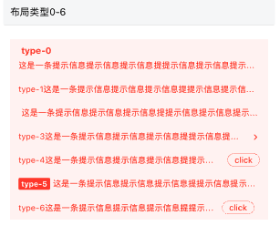
const typeRender = () => (
<View style={styles.container}>
<Tip
type={0}
title={"type-0"}
text={TEXT}
/>
<Tip
type={1}
title={"type-1"}
text={TEXT}
/>
<Tip
type={2}
title={"type-2"}
text={TEXT}
/>
<Tip
type={3}
title={"type-3"}
text={TEXT}
/>
<Tip
type={4}
title={"type-4"}
text={TEXT}
rightText="click"
/>
<Tip
type={5}
title={"type-5"}
text={TEXT}
/>
<Tip
type={6}
title={"type-6"}
text={TEXT}
rightText="click"
/>
</View>
);
显示代码
import { Tip } from '@qnpm/q-tips/src';
const TEXT = "这是一条" +
"提示信息提示信息" +
"提示信息提提示信息" +
"提示信息提示信息" +
"提示信息提示信息";
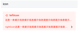
const iconRender = () => (
<View style={styles.container}>
<Tip
leftIcon='trumpet'
title={"leftIcon"}
text={TEXT}
/>
<Tip
type={1}
rightIcon={
<Icon name='chevronForward'/>
}
title={"rightIcon"}
text={TEXT}
/>
</View>
);

显示代码
import { Tip } from '@qnpm/q-tips/src';

const TEXT = "这是一条" +
  "提示信息提示信息" +
  "提示信息提提示信息" +
  "提示信息提示信息" +
  "提示信息提示信息";

const marqueeRender = () => (
  <View style={styles.container}>
      <Tip
        mode='link'
        type={5}
        title='marquee'
        text={TEXT}
        marqueeProps={{
            loop: true,
            leading: 200,
            trailing: 500
        }}
      />
  </View>
);
显示代码
import { Tips } from '@qnpm/q-tips';

const verticalMarqueeRender = () => {
    const tips = [{
        text: 'TEXT'
    },{
        text: '22222'
    }];
    const yellowTips = [{
        themeType: 'powerful',
        text: 'TEXT'
    },{
        themeType: 'powerful',
        text: '22222'
    }];
    return (
        <View style={styles.container}>
            <Tips
                leftLabel={
                    <Icon
                        style={{marginRight: 4}}
                        name='trumpet'
                        size={16}
                        color={'red'}
                    />
                }
                carouselProps={{
                    loop: true
                }}
                onPress={() => alert('click')}
                tipList={tips}
                mode="link"
            />
            <View style={{height: 10}} />
            <Tips
                leftLabel={
                    <Icon
                        style={{marginRight: 4}}
                        name='trumpet'
                        size={16}
                        color={'#FF6600'}
                    />}
                carouselProps={{
                    loop: true
                }}
                customStyle={{
                    backgroundColor: '#FFF7F2',
                    brandColor: '#FF6600'
                }}
                onPress={() => alert('click')}
                tipList={yellowTips}
                mode="link"
            />
        </View>
    );
};
显示代码
import { Tip } from '@qnpm/q-tips';
const TEXT = "这是一条" +
"提示信息提示信息" +
"提示信息提提示信息" +
"提示信息提示信息" +
"提示信息提示信息";
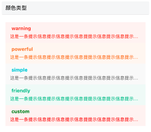
const themeRender = () => (
<View style={styles.container}>
<Tip
themeType="warning"
title={"warning"}
text={TEXT}
/>
<Tip
themeType="powerful"
title={"powerful"}
text={TEXT}
/>
<Tip
themeType="simple"
title={"simple"}
text={TEXT}
/>
<Tip
themeType="friendly"
title={"friendly"}
text={TEXT}
/>
<Tip
title={"custom"}
text={TEXT}
customStyle={{
brandColor: 'green',
backgroundColor: '#FFF4F3',
textColor: 'red'
}}
/>
</View>
);

显示代码
import { Tip } from '@qnpm/q-tips';

const TEXT = "这是一条" +
  "提示信息提示信息" +
  "提示信息提提示信息" +
  "提示信息提示信息" +
  "提示信息提示信息";

const clickRender = () => (
  <View style={styles.container}>
      <Tip
        title={"closable"}
        text={TEXT}
        mode="closable"
        onClose={() => {
            alert('close');
        }}
      />
      <Tip
        title={"link"}
        text={TEXT}
        mode="link"
        onPress={() => {
            alert('link');
        }}
      />
  </View>
);
显示代码
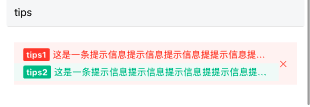
import { Tips } from '@qnpm/q-tips';

const TEXT = "这是一条" +
  "提示信息提示信息" +
  "提示信息提提示信息" +
  "提示信息提示信息" +
  "提示信息提示信息";

const tipsRender = () => {
    const tips = [{
        type: 5,
        title: 'tips1',
        themeType: 'warning',
        text: TEXT
    },{
        type: 5,
        title: 'tips2',
        themeType: 'friendly',
        text: TEXT
    }]
    return (
      <View style={styles.container}>
          <Tips
            onPress={() => alert('click')}
            tipList={tips}
            mode="closable"
          />
      </View>
    );
};
属性说明
| 属性名 | 类型 | 默认值 | 是否必须 | 说明 |
|---|---|---|---|---|
accessibilityPreName |
string |
`` | false |
无障碍标签前缀 |
customStyle |
backgroundColor|textColor|brandColor|operationAreaColor(不传会使用brandColor) |
null | false |
自定义颜色 |
leftIcon |
string or ReactNode |
'' | false |
icon名字或icon组件, 垂直方向的icon+标题 |
marqueeProps |
object |
false |
false |
走马灯广播相关 |
mode |
string |
'' | false |
定义行为, closable为关闭, link为跳转 |
numberOfLines |
number |
1 | false |
中间文字区域展示多少行 |
onClose |
()=> void |
undefined | false |
关闭回调函数 |
onPress |
()=> void; |
undefined | false |
点击回调函数 |
rightIcon |
string or ReactNode |
'' | false |
右侧区域,箭头,关闭, 或者自定义React节点信息 |
rightText |
string |
null | false |
右侧按钮或者箭头前的文字(根据type来) |
text |
string |
'' | true |
tip内容 |
title |
string |
'' | false |
标题文字区域 |
themeType |
warning or powerful or simple or friendly |
simple |
false |
展示颜色类型 |
type |
0-6 |
0 | false |
布局类型 |
carouselProps |
object |
'' | false |
纵向轮播属性 |
leftLabel |
ReactNode |
null | false |
纵向轮播左侧标签(只有carouselProps存在时,才有效) |
marqueeProps 说明
| 属性名 | 类型 | 默认值 | 是否必须 | 说明 |
|---|---|---|---|---|
loop |
boolean |
false |
false |
横向广播 |
leading |
number |
500 |
false |
滚动到末尾的delay时间 |
trailing |
number |
800 |
false |
滚动回头部的延迟时间 |
carouselProps 说明
| 属性名 | 类型 | 默认值 | 是否必须 | 说明 |
|---|---|---|---|---|
loop |
boolean |
true |
false |
是否循环播放 |
duration |
number |
1500 |
false |
动画运动时常 |
interval |
number |
2000 |
false |
动画执行间隔 |