q-popover 汽泡浮层组件
点击元素,渲染弹出气泡浮层
安装
npm install @qnpm/q-popover @qnpm/qportal --save --registry=http://npmrepo.corp.qunar.com
使用说明
⚠️:组件内部依赖
@qnpm/qportal
import { Provider } from '@qnpm/qportal';
import { Popover } from '@qnpm/q-popover';
示例使用到的组件
const onClose = () => {
this.setState({ isVisible: false });
}
const onPress = () => {
this.setState({ isVisible: true });
}
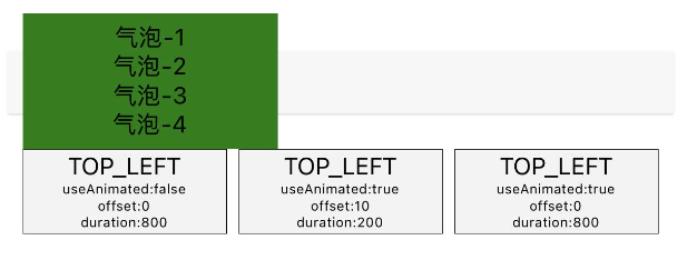
const popoverContent = () => (
<TouchableOpacity
style={styles.popover}
activeOpacity={1}>
{[1,2,3,4].map(
(item) => (<Text key={item}>{`气泡-${item}`}</Text>)
)}
</TouchableOpacity>
)
const Btn = () => (
<TouchableOpacity
style={styles.btn}
onPress={this.onPress}
/>);
const styles = StyleSheet.create({
popover: {
width: 150,
height: 80,
backgroundColor: 'green',
justifyContent: 'center',
alignItems: 'center'
},
btn: {
backgroundColor: '#f3f3f3',
width: 120,
miniHeight: 50,
paddingVertical: 10,
justifyContent: 'center',
alignItems: 'center',
borderWidth: StyleSheet.hairlineWidth
}
});
示例
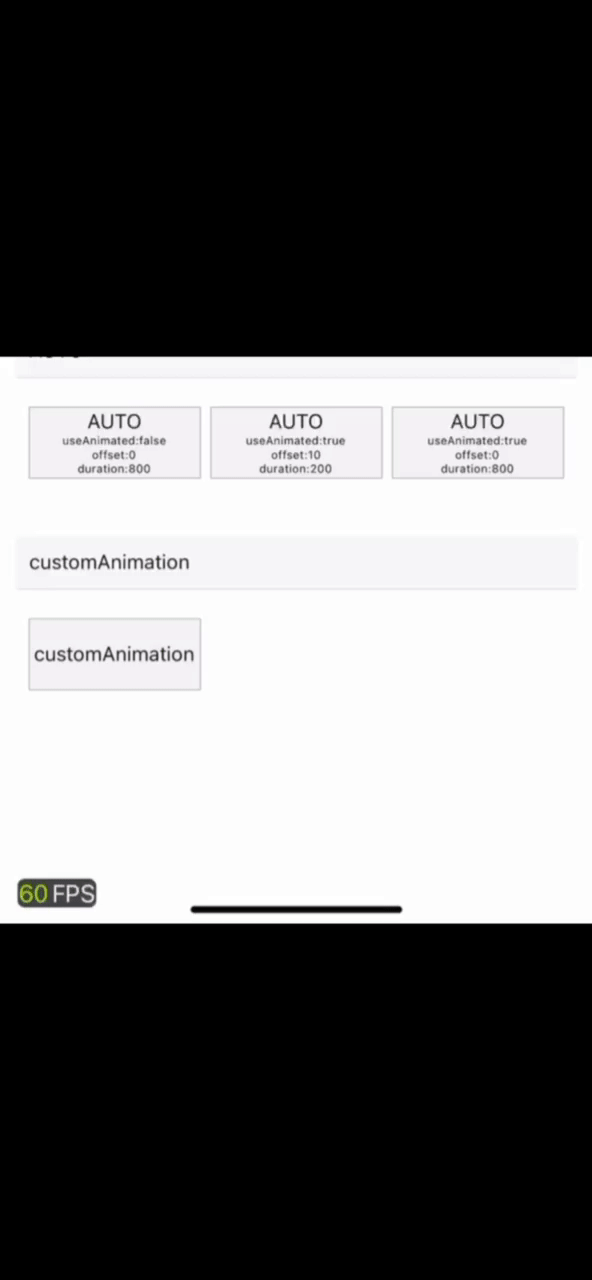
显示代码
const onShow = ({ height }) => {
    translateY.setValue(height);
    opacity.setValue(1);
    Animated.timing(this.translateY, {
        duration: 300,
        toValue: 0,
        useNativeDriver: true
    }).start();
}

const onClose = () => {
    const { placement } = this.props;
    return new Promise((res) => {
        Animated.timing(this.opacity, {
            duration: 500,
            toValue: 0,
            useNativeDriver: true
        }).start(() => {
            res(true);
            this.setState({ isVisible: false });
        });
    });
}
<Popover
    isVisible={isVisible}
    fromRect={
        { x: 0, y: 0, width: 120, height: 50 }
    } // 按钮的位置信息
    placement='TOP_LEFT'
    useAnimated={false}
    popoverSize={{ width: 150, height: 80 }}
    customStyle={{
            opacity: this.opacity,
            transform: [{ translateY: this.translateY }]
        }}
    onShow={onShow}
    onClose={onClose}
    content={popoverContent}
>
    <Btn />
</Popover>
显示代码
<Popover
    isVisible={isVisible}
    fromRect={
        { x: 0, y: 0, width: 120, height: 50 }
    } // 按钮的位置信息
    placement='TOP_LEFT'
    useAnimated={false}
    popoverSize={{ width: 150, height: 80 }}
    onClose={this.onClose}
    content={popoverContent}
>
    <Btn />
</Popover>
显示代码
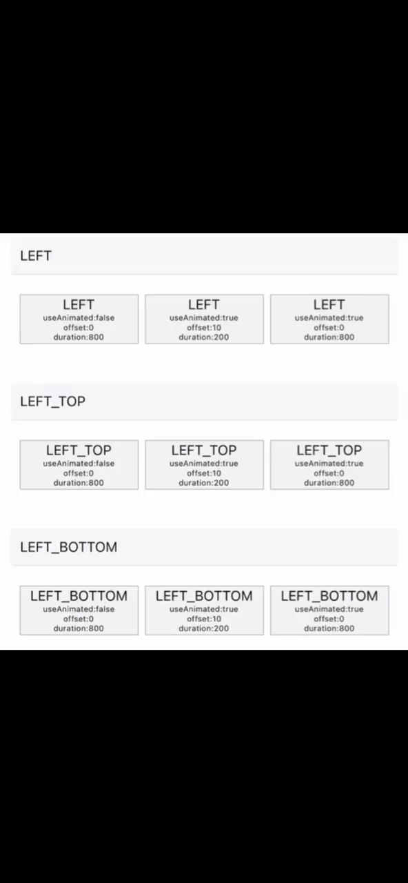
<Popover
    isVisible={isVisible}
    fromRect={
        { x: 0, y: 0, width: 120, height: 50 }
    } // 按钮的位置信息
    placement='LEFT_TOP'
    popoverSize={{ width: 150, height: 80 }}
    offset={10}
    duration={200}
    onClose={this.onClose}
    content={popoverContent}
>
    <Btn />
</Popover>
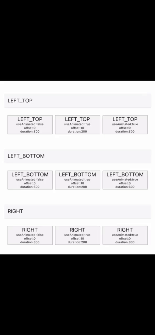
显示代码
<Popover
    isVisible={isVisible}
    fromRect={
        { x: 0, y: 0, width: 120, height: 50 }
    } // 按钮的位置信息
    placement='LEFT_BOTTOM'
    popoverSize={{ width: 150, height: 80 }}
    duration={800}
    onClose={this.onClose}
    content={popoverContent}
>
    <Btn />
</Popover>
属性说明
| 属性名 | 类型 | 是否必须 | 默认值 | 说明 |
|---|---|---|---|---|
isVisible |
boolean |
true |
- | 显示/隐藏气泡 |
content |
React.ReactNode 或 (() => React.ReactNode) |
true |
- | 气泡 |
popoverSize |
{width: number; height: number} |
false |
- | 可选项,气泡的大小,传递此属性可以避免动态测量 |
placement |
String |
false |
- | 放置在指定的位置,取值为PlacementEnumKey |
onClose |
({ width: number, height: number }) => Promise.resolve |
false |
- | 隐藏气泡回调 |
onShow |
({ width: number, height: number }) => void |
false |
- | 显示气泡回调 |
duration |
number |
false |
200 |
气泡动画过渡时长, useAnimated为false时无效 |
useAnimated |
boolean |
false |
true |
是否开启动画 |
offset |
number |
false |
0 |
默认为0, 0: 相邻; >0: 远离; <0: 接近(发生重叠) |
customStyle |
CustomStyle |
false |
- | 自定义样式,支持属性见类型文件 |
btnPositionFixed |
boolean |
false |
false |
如果触发气泡的按钮相对屏幕位置是不变的,可以设为true |
customStyle 说明
| 属性名 | 类型 | 默认值 | 是否必须 | 说明 |
|---|---|---|---|---|
backgroundColor |
string |
- |
false |
气泡出现时整个窗口的背景颜色 |
transform |
Array<Object> |
- |
false |
变换 |
opacity |
number 或 Animated.Value |
- |
false |
气泡透明度 |